Goal
The goal of this study was to establish a usability baseline for core patient tasks and identify where new features were introducing friction into essential experiences like messaging providers, scheduling care, and managing health information.
Choose What To Measure
Task 1 Write a message to your PCP
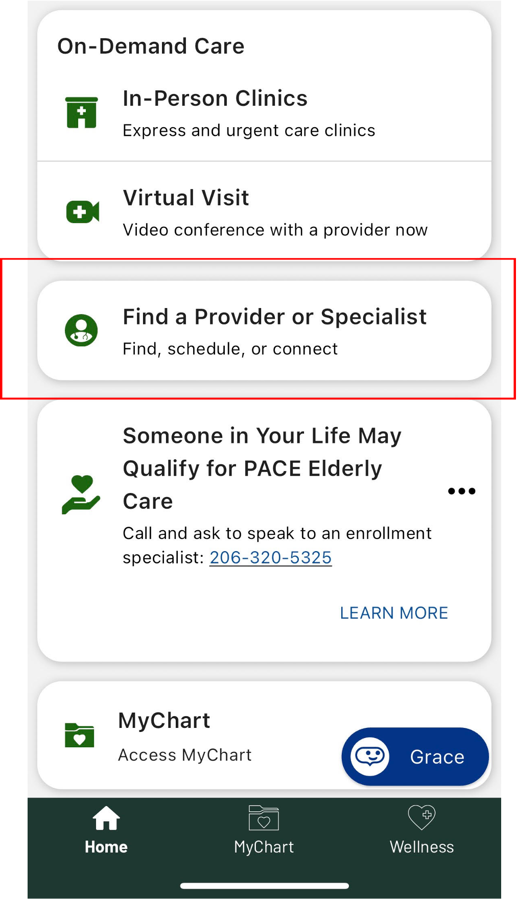
Task 2 Find a specialist
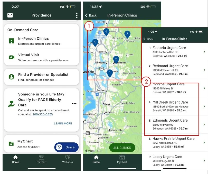
Task 3 Schedule An in-person clinics
Task 4 Book from NBA
Task 5 Find an app to download
Task 6 Schedule apt with your PCP
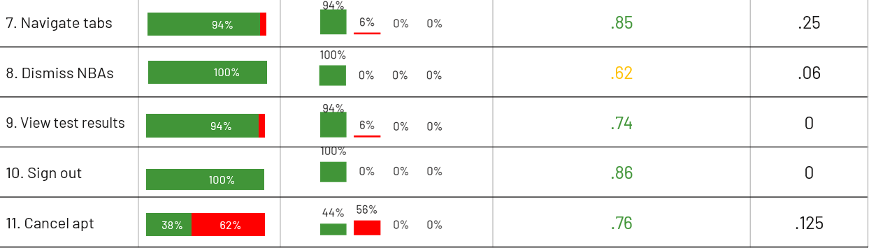
Task 7 Navigate the tabs
Task 8 NBA removal
Task 9 Get your test results
Task 10 Sign out
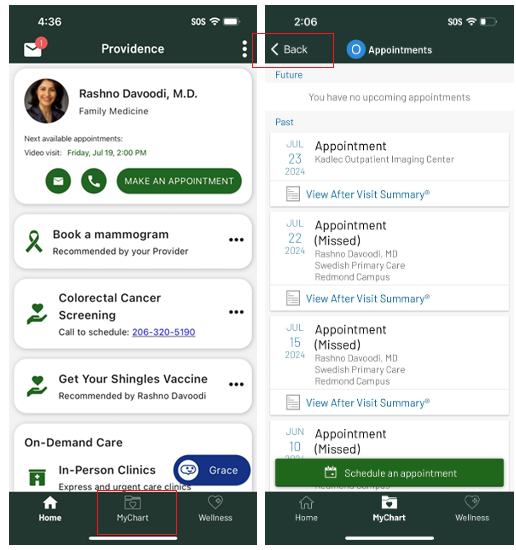
Task 11 Cancel your second appointment
Collect First Measurement
No think aloud protocol
Negatively impacts time on task, BUT debriefed the user after the study to learn more about their issues
Users were allowed to fail
Help would negatively impact the number of errors and success rate calculation
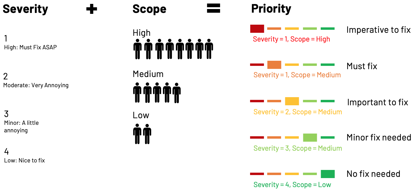
Severity & Scope To Prioritize Issues
Metric Overview
Insights and Pattern Summary
UI elements did not support their intended interactions or were not sufficiently surfaced.
Tasks that informed this insight
Across these tasks, UI elements lacked expected functionality, which increased effort, slowed task completion, and contributed to errors
Task 2: Find A Specialist
Filters did not support multi-select, forcing repeated refinements
Dropdowns were not responsive on mobile
Search behaved like a filter causing confusion and excessive scrolling
Global search was by passed
Task 5: Finding the right app via ads
Ads did not clearly appear as functional app elements
Users hesitated or avoided interacting with them
Task 11: Cancel the second appointment
Carousel indicators were not sufficiently visible
Most users located the first appointment but missed the second
This directly contributed to higher failure and error rates
Why this matters
Patients rely on clear visual cues to understand what is interactive
When UI are inconsistent or hidden, users expend extra effort or fail
In healthcare, this creates frustration and can reduce confidence in completing critical actions
Recommendation
Make interactive elements clearly distinguishable from static content
Ensure carousels and navigation elements are visible
Improve functionality of dropdowns and filters
Consider standardizing patterns across all flows to reduce cognitive load
Scheduling navigation lacks clear orientation, causing users to restart tasks
Tasks that informed this insight
Across both tasks, users became disoriented during scheduling due to unclear navigation, hierarchy, and progress feedback, which caused them to restart the flow
Task 3: Users faced multiple navigation options without clear hierarchy or feedback, interrupting their sense of progress and causing them to restart by returning to previous screens or Home.
Task 4: The NBA card linked to a generic appointments page instead of directly into scheduling, requiring repeated selections and leading users to question whether they were in the right correct scheduling flow and restart
Why this matters
Scheduling is a high-intent task. When navigation does not clearly communicate location, progress, or next steps, users lose confidence and restart rather than continue. This increases friction, extends time on task, and risks abandonment during a critical conversion moment.
Recommendation
Provide direct paths into scheduling flows
Clarify navigation hierarchy during schedulinMake progress and location visible
Task completion did not equate to patient confidence
Tasks that informed this insight
While many tasks showed high completion rates, efficiency scores, error patterns, and navigation behavior revealed uncertainty, hesitation, and extra effort across key patient flows.
Task 3: Users faced multiple navigation options without clear hierarchy or feedback, interrupting their sense of progress and causing them to restart by returning to previous screens or Home.
Task 4: The NBA card linked to a generic appointments page instead of directly into scheduling, requiring repeated selections and leading users to question whether they were in the right correct scheduling flow and restart
Why This Matters
In healthcare, confidence matters as much as completion.
When patients aren’t sure they’re doing the right thing, they’re less likely to trust the system — especially for scheduling, cancellations, or follow-up care.
That uncertainty increases cognitive load and can lead to abandonment outside of a moderated test.”8
Recommendations
Design for clarity, not just completion
Reduce trial-and-error by improving affordances and feedback
Use efficiency and error patterns — not success alone — to guide prioritization
Validate confidence explicitly in future testing (e.g., post-task confidence checks)
Task 1 Issues
Sending a message is simple
2 used MyChart since this is what they’ve done before. It was not a discoverability issue
“Just push a button, it makes a message to my doctor and it's very clear.”
“A nice shortcut to send a message to my provider”
Easier than using MyChart
MyChart is harder because you must select from a list of providers, nurses, and MAs. With Prov App users feel confident the message will be delivered to the right person AND it guides you through writing the message
“I liked this way more because it actually gave me different options. MyChart, I don't think it had new symptoms or it didn't guide me, so it's just a random message
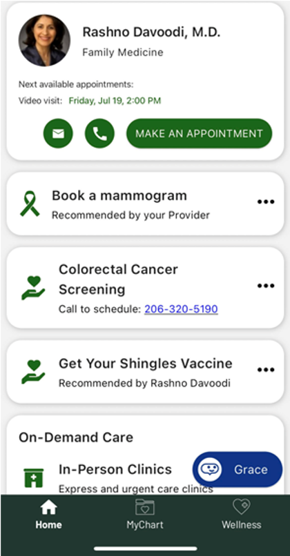
Task 1: You have a sharp ringing in your left ear that you never experienced before, and you are unsure what you should do. Send your primary care provider (Dr. Rashno Davoodi) a note to inform him about that to get his recommendation.
Task 2 Issues
Entry point is clear for all users
The card placement, content & design made it easy for users to quickly start the task
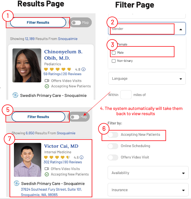
Task 2: You have an 18-month-old baby, and you want a male doctor who accepts new patients. Use the app to find a doctor with these two characteristics then say his name.
Filter doesn’t allow for multiple selections
ACTUAL
Filter results
Select gender
Select “male”
*VIEW RESUTLS
Filter results
Select “Accepting new patients”
*VIEW RESUTLS
Filter results
Search OR select specialty
*VIEW RESUTLS
The system auto. takes them back to view results
Choose How To Measure
Success rate
Average of users who complete task successfully
Error rate
Shows the percentage of users in each category: 0 | 1 – 2 | 3 – 4 | 5+
Turns
Average no of times users switch between tabs to complete the task
Efficiency rate. Expert time / User completion time
Expert time Researcher’s time to complete task
User completion time Starts after the task is read and ends when the user says “finished”
Ratio is scored between 0 and 1
Scores close to 0 means the task was difficult to complete
Scores close to 1 means it was easier to complete
Users
16 users : 8 Male , 8 Female.
Visited their primary care physician in the last 6 months.
50% have MyChart account.

Dropdowns are not fully web responsive
When clicking any dropdown, the screen resizes to outside the mobile frame. Users must resize the screen manually to see their options.
Task 6 Issues
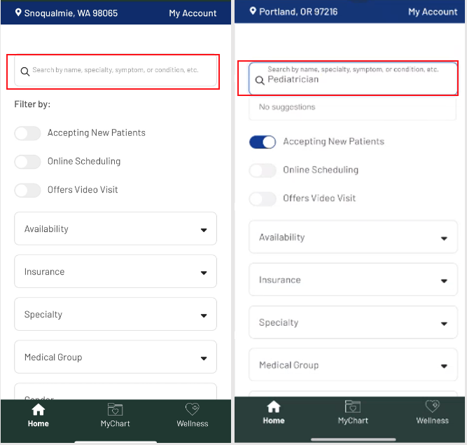
Search behaves like a filter, not a global search
Users type “pediatrician” expecting to find the occupation, but the search only filters specialties.
This causes confusion: users see “no suggestions” or get a subset of results that doesn’t include what they want.
Users expressed frustration and sometimes gave up.
“can’t find pediatrics only. I give up . done”
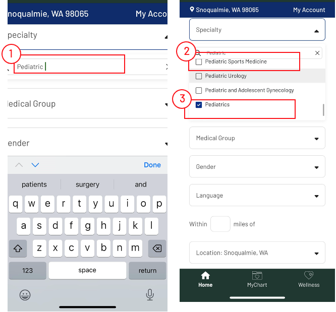
Excessive scrolling to find Pediatrics
Users must scroll through many specialties (up to 40) to reach “Pediatrics,” which is tedious on mobile.
Sub-specialties appear first, leading to additional scrolling and selection errors.
Some users select the wrong specialty or abandon the search out of fatigue.
Users struggle to identify the correct option
“Pediatric” appears as a parent category with many sub-specialties, causing confusion.
Users attempt workarounds, like typing “pediatric ” to narrow the list, but this often excludes the correct option.
”I kind of wish that pediatrician had showed up at the top, so I didn't have to go as far, but I was able to find it finally”
“Why do I have to scroll that far to get to Pediatrics”
“I am not sure which one to choose. Oh, I am looking for pediatrician”
“I am looking for pediatric. All these are all very specific.”
This helps explain why errors were high for the 3–5 category and efficiency was low.
Task 3 Issues


IDEAL
Filter results
Select gender
Select “male”
Select “Accepting new patients”
Search OR select specialty
View results
Navigation is confusing causing the user restarting the task
The current navigation introduces several simultaneous choices without clearly establishing hierarchy or feedback, which can interrupt the user’s sense of progress and lead to restarts.
Task 3: Imagine that one day you drove to Everett in Seattle Washington. After a long drive you start to have a headache. You thought about using the app to schedule an appt at an urgent care nearby Everett Broadway.
Task 4 Issues
Multi Layered Navigation Causes Confusion
Finding a screening mammogram is difficult because users first go to a generic scheduling page, then navigate to the third category of appointments, and finally to ‘Imaging’ under ‘Choose Your Preferred Visit Type.’
“I'm curious if this is still under the mammogram thing, or if somehow I've ended up in scheduling for something else.”
Task 4: After discussing with your doctor some symptoms, your doctor recommended you schedule a mammogram screen. Use the app to schedule the appointment
Task 5 Issues
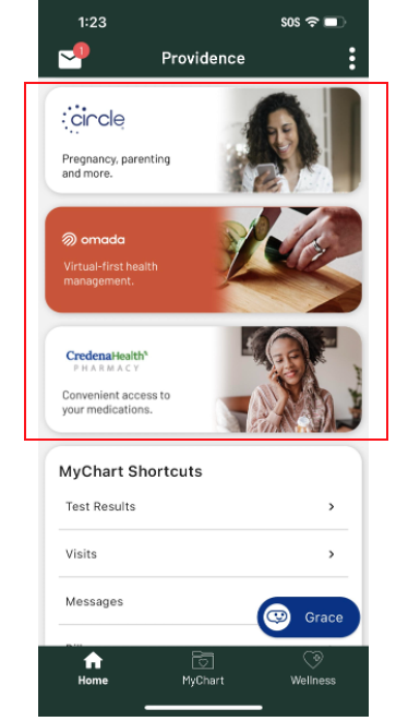
The “Ads” don’t look like apps
The cards don’t indicate Circle, Amada, CredenaHealth are apps, nor is there enough info for them to want to check it out. They are noticeable, but not thought of as apps.
As result, users went to the “Wellness” tab to find apps. It wasn’t that they didn’t SEE the cards, they just didn’t equate them with a way to complete the task
I thought it was like a Teladoc thing as it's virtual health management, so I kind of thought that it have to do with virtual visits.
I am not sure if these are apps for monitoring her health.. The title is so generic”
Users also wanted a “heads up” that they were leaving the app
Adding the word ‘connect to’ would be more sensible, in my mind. To tell me that I am leaving providence app and going somewhere else
Add header that says external link or something to let me know that I am leaving to go somewhere else
. This helps explain why the no of turns was the highest.
Task 5: Imagine your doctor recommend an app that will help you remotely monitor your health. Use Providence app to help you download the right app
Booking an appointment is simple
1 used MyChart since this is what they’ve done before. It was not a discoverability issue
Task 6: It's time for your yearly check in with your PCP, Dr. Rashno Davoodi where you can see her in his office. The most important thing to discuss with her is your overall health.
Task 7 Issues
Finding blog content simple
The names of the tabs made sense to users, making it easy to find articles and education materials under the “Wellness” tab
really a navigable app
easy to navigate around
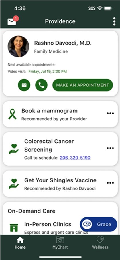
Task 8 Issues
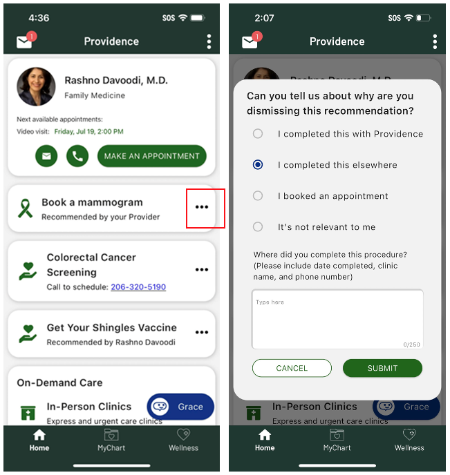
Task 8: You had your mammogram screening taken care of. Now you don’t want to see the reminder about getting the colorectal cancer screening in the app
Task 9 Issues
Finding test results is simple
All but 1 user successfully completed this task. He failed because of how the SDK works. The SDK remembers the last page visited within MyChart which in his case was the appointments page. He didn’t notice the “back” button to navigate back to the MyChart landing page
Task 9: You had a blood drawn a week ago and now you need to see the test results
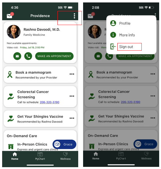
Task 10: You are done using the App and you would like to logout
Task 11 Issues
Team
Failure
Errors
Root Casues


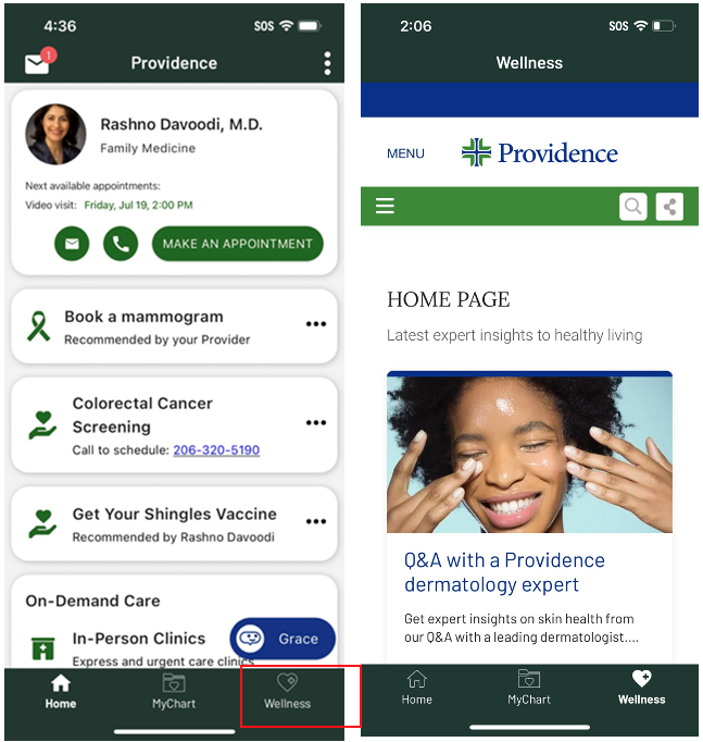
Task 7: Find the articles in the app and read the title of the second article loud.
Dismissing an NBA is simple
Users understood to use the … to dismiss NBAs from the homepage. However, they wondering if it was a permanent dismiss or if they would re-appear when needed
But wanted more personalization
Users wondered why if they completed the screening at Providence why they got a reminder at all. They felt the system should have the date completed, the clinic name and the phone number.
Task 10 Issues
Signing out is SIMPLE!
100% success, NO errors, high efficiency rate
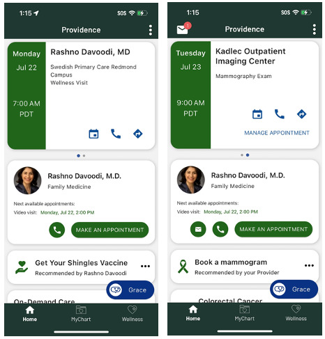
Carousel dots were overlooked
Ten users did not notice the carousel dots or were unfamiliar with this mobile pattern. As a result, they found the first appointment but missed the second one, highlighting a visibility and discoverability
That explains why the failure and the error rates are high.
Task 11: You just found out that you won’t need your yearly check in with your PCP / Mammogram, which you have scheduled earlier. What will you do?

Usability Issue Summary
Since the app is a PLATFORM, we coordinate fixes with other teams. Thus, we track where the issues stem from
SDK
4
15%
Deep linking to appointment page and not mammogram booking page
Praia
10
8%
Not deep linking to mammogram due to limitations in the SD
Carousel dots need to be more visible
Not clear what dismiss dismisses
MDEX
5
52%
Search is not mobile friendly
Prov App
3
14%
The language on the cards do not indicate that the Ads are Apps
Language on dismiss questionnaire doesn’t reflect personalization.